User Guide#
This guide will demonstrate and explain the features and functionality of BSAVI by creating a visualization that will dynamically generate sine waves from frequency, phase, and amplitude data. It will follow the structure of the Cosmology & CLASS tutorials without requiring install of CLASS or any cosmologist-specific packages. A basic knowledge of plotting with HoloViews is suggested, since it is the utility that provides the interactive plots for this package.
Works in a Jupyter Notebook or as a standalone Python script. To see the full interactivity, download the “userguide” notebook here
# imports
import bsavi as bsv
import numpy as np
import pandas as pd
Suppose we want to visualize how changes in amplitude, frequency, and phase affect some wave functions. Let’s choose the sine and sinc functions.
A sine wave can be defined as:
where \(A\) is the amplitude, \(f\) is the frequency, \(\omega\) is the angular frequency, and \(\phi\) is the phase.
The sinc function is simply:
First let’s generate some random data in three dimensions. These will be samples of our amplitudes, frequencies and phases.
ndim, nsamples = 3, 1000

np.random.seed(42)
data1 = np.random.randn(ndim * 4 * nsamples // 5).reshape(
    [4 * nsamples // 5, ndim]
)
data2 = 4 * np.random.rand(ndim)[None, :] + np.random.randn(
    ndim * nsamples // 5
).reshape([nsamples // 5, ndim])
data = np.vstack([data1, data2])
Then convert it into a pandas DataFrame (BSAVI only accepts DataFrames, for now) and define column labels with some fancy \(\LaTeX\) formatting:
param_names = ['frequency', 'phase', 'amplitude']
latex = ['\omega / 2\pi', '\phi', '\mathrm{amplitude}']
df = pd.DataFrame(data, columns=param_names)
latex_dict = dict(zip(param_names, latex))
df.head()
| frequency | phase | amplitude | |
|---|---|---|---|
| 0 | 0.496714 | -0.138264 | 0.647689 |
| 1 | 1.523030 | -0.234153 | -0.234137 |
| 2 | 1.579213 | 0.767435 | -0.469474 |
| 3 | 0.542560 | -0.463418 | -0.465730 |
| 4 | 0.241962 | -1.913280 | -1.724918 |
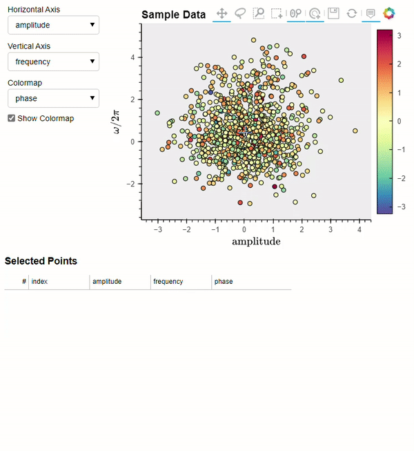
We now have a table of samples which we can visualize directly with
bsv.viz. Bringing along the latex dict we made earlier:
bsv.viz(df, latex_dict=latex_dict)
Writing Functions for Observables#
Next, we will define the function that takes a given row of samples from the table above and uses it to compute the two waveforms.
Data Formats#
Any function that computes data for an Observable must return data in the following format:
results = [
    {'x': np.array([x1, x2, ...]), 'y': np.array([y1, y2, ...])},
    {'z': np.array([z1, z2, ...]), 'w': np.array([w1, w2, ...])},
    ...
]
Examining this format more closely: we have a list of dictionaries that contain two 1-D NumPy arrays, with their parameter names as the keys. BSAVI will interpret each dict as its own observable and attempt to plot it with the first array on the x axis and the second array on the y axis. The keys will be used to label their respective axes.
This rather specific format is related to how HoloViews interfaces with tabular datasets. Their documentation gives a full list of accepted data formats. While BSAVI currently only supports the one detailed above, eventually all the pure Python, Numpy, and Pandas data storage formats will be supported.
Another note: Observables and functions are one-to-one, so if you’d rather have separate functions that all only return one set of data points, but still want to visualize them together, you will have to create an Observable for each. You are allowed to pass any amount of arguments into each function though.
Most importantly, the function must have logic to select a sample from
an input dataset according to its index. This is because BSAVI will pass
the index corresponding to a point selected on the plot into your
function. Therefore, index is required as the first argument. Then
you can have an arbitrary amount of arguments. The example below is how
it should be done if the input dataset is a DataFrame.
def compute_waveforms(index, input_data):
    selection = input_data.iloc[[index]]
    x = np.linspace(-4*np.pi, 4*np.pi, 1000)
    angular_freq = 2*np.pi*selection['frequency'].iloc[0]
    phase = selection['phase'].iloc[0]
    amp = selection['amplitude'].iloc[0]
    sin = amp * np.sin(angular_freq*x + phase)
    sinc = amp * np.sinc(angular_freq*x/np.pi + phase)
    waves = [
        {'x': x, 'sin(x)': sin},
        {'x': x, 'sinc(x)': sinc},
    ]
    return waves
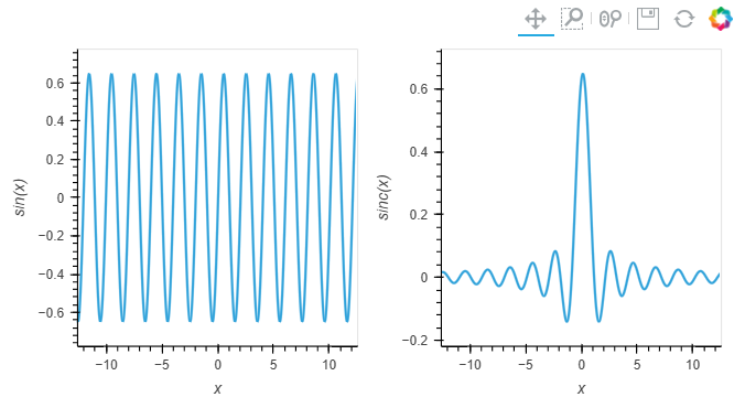
# example run
sin, sinc = compute_waveforms(0, df)
# plot them using holoviews
import holoviews as hv
layout = hv.Curve(sin, 'x', 'sin(x)') + hv.Curve(sinc, 'x', 'sinc(x)')
layout
Creating an Observable#
Now we are ready to set up the Observable. This is a way to associate your data with how it should be plotted, including title and axis labels, LaTeX formatting, and other customizations. BSAVI will use all this information when generating the visualizations. There are two types, Observable and LiveObservable, which deal with static data and dynamic calculations, respectively. Below is the full list of options for both BSAVI Observable types:
bsavi.Observable: the standard Observable, which takes tabular data
to make plots.
- name: string or list of strings
specifies the display name of the observable for things like plot titles
- data: dict-like or list of dict-likes
- the data to associated with that observable. can be python dict (or pandas DataFrame)
whose keys (or column names) will be used for things like plot axis labels.
- plot_type: string
specifies how the data should be visualized. currently can pick ‘Curve’, ‘Bars’, or ‘Scatter’
- plot_opts: holoviews Options object
customization options for the observable plot. see Holoviews documentation
- latex_labels: dict
dictionary of plain text parameter names as keys and latex versions as values for the data table
bsavi.LiveObservable: an Observable that takes a function and uses it
to calculate data for making plots. Has the same options as bsavi.Observable,
but data is replaced with:
- myfunc: callable
a user-provided function that returns data. can return more than one set of data.
- myfunc_args: tuple
arguments for user-provided function
Note: BSAVI is limited to 2-D graphs (two plot axes), so there are three plot_types available:
'Curve': A continuous line drawn through each point'Scatter': A simple scatterplot of each point'Bars': A series of bars with their heights determined by the y-axis value at each point
Customizations#
To apply customizations to your plots, use HoloViews Options (documentation here). They allow you to set axis limits, add logarithmic scaling to each axis, and change the color cycles used for each plot element.
A brief summary of the most common options you might need:
xlim, ylim: tuple of the lower and upper axis range limits, to be used instead of auto axis scaling. Use
Noneto denote no explicit upper/lower limit.For example: ylim=(None, 10) would cut the figure off for anything above 10, but the lower y value will be adjusted to fit the figure into the frame.
logx, logy: boolean values to set logarithmic scaling on either axis. Default is False.
height, width: integer values to set the size of the plot frame. BSAVI sets
height=400, width=500by default.color: sets the color of the plotted objects. This can be:
a single color, e.g.
'red'ora cycle/palette, which applies a colormap to an overlay and replaces the default colormap.
# setting up some customizations first
import holoviews as hv
from holoviews import opts
opts1 = opts.Curve(xlim=(-4*np.pi, 4*np.pi), color=hv.Cycle('YlOrRd'), bgcolor='#151515')
opts2 = opts.Scatter(xlim=(-4*np.pi, 4*np.pi), color=hv.Cycle('PuBuGn'), bgcolor='#151515')

waves_latex = {
    'x': 'x',
    'sin(x)': '\sin{x}',
    'sinc(x)': '1/\sin{x}',
}
Pre-Computed Observables#
The function we wrote earlier, compute_waveforms, is pretty fast.
But sometimes, we might have calculations that take several minutes or
longer to complete. Clicking on a point in the sample plot and waiting
minutes for a graph of your Observable to appear is not very fun. If we
compute our observable for every sample beforehand, it will make for a
more seamless interactive experience.
# go through the entire set of samples, computing waveforms for each set:
waves_list = []
for idx in range(0, len(df)):
    wave = compute_waveforms(idx, df)
    waves_list.append(wave)

waves_df = pd.DataFrame(waves_list, columns=['sin(x)', 'sinc(x)'])
Now we can create an Observable, giving it the wave data and specifying
plot titles, plot types, customizations, and latex labels.
waveforms = bsv.Observable(
    name=['sin(x)', 'sinc(x)'],
    data=computed_df,
    plot_type=['Curve', 'Scatter'],
    plot_opts=[opts1, opts2],
    latex_labels=waves_latex
)
We can check that it works with
waveforms.draw_plot([0])
Dynamically Computed Observables#
On the other hand, our function is fast enough that we can just have
BSAVI call it every time we select a sample. In this case, we will use
LiveObservable and give it our function, along with a tuple containing its
arguments. We can skip the first argument, index, since it’s
automatically handled by the visualizer.
dynamic_waveforms = bsv.LiveObservable(
    name=['sin(x)', 'sinc(x)'],
    myfunc=compute_waveforms,
    myfunc_args=(df,),
    plot_type='Curve',
    plot_opts=[opts1, opts2],
    latex_labels=waves_latex
)
Again, check that it plots correctly with
dynamic_waveforms.draw_plot([0])
Visualizing#
Finally, we will use viz to interactively visualize the whole thing.
Here’s an overview of the function arguments: - data: (Pandas
DataFrame) the data you want shown as a scatter plot - observables:
(list) a list of observables you’d like to visualize -
show_observables: (Boolean) whether you want to see the observable
plots or not (default = False if no observables, True if observables is
not None). - latex_dict: (dict) a dictionary containing the Latex
formatting for your axis labels (default = None)
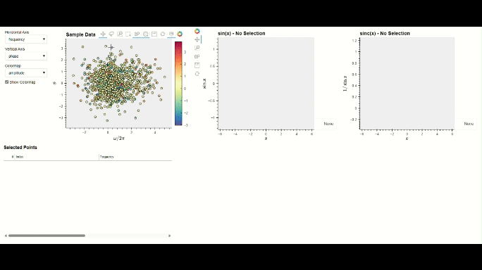
Run the cell below to test out the interactivity by selecting points on the scatterplot in the left section, and see what appears on the plots in the right section!
bsv.viz(data=df, observables=[waveforms], latex_dict=latex_dict).servable()
If running in a Jupyter Notebook, you should see a dashboard displayed inline. If you’d rather see it in a separate browser window, run the cell below.
server = bsv.viz(data=df, observables=[waveforms], latex_dict=latex_dict).show()
Once you are done with it, stop the server with:
server.stop()
Another option is to write all your code in a standalone script. Make sure you use
bsv.viz with the .servable() method, and that it is the last line of code in
your script. Then serve it with:
$ panel serve path/to/my_app.py
Then click on the localhost link to view the dashboard in a separate browser tab.